
Ensuring that your website design is optimized for mobile users is crucial in today’s digital landscape. With the increasing number of people using their smartphones and tablets to access the internet, neglecting mobile optimization can have negative implications for your business. In this blog post, we will explore the reasons why mobile optimization matters and how it can impact the success of your website. From improved user experience to higher search engine rankings, making sure that your website is mobile-friendly is essential for reaching and engaging with your audience. Stay tuned to learn more about the importance of mobile optimization and how you can ensure that your website is catering to mobile users effectively.
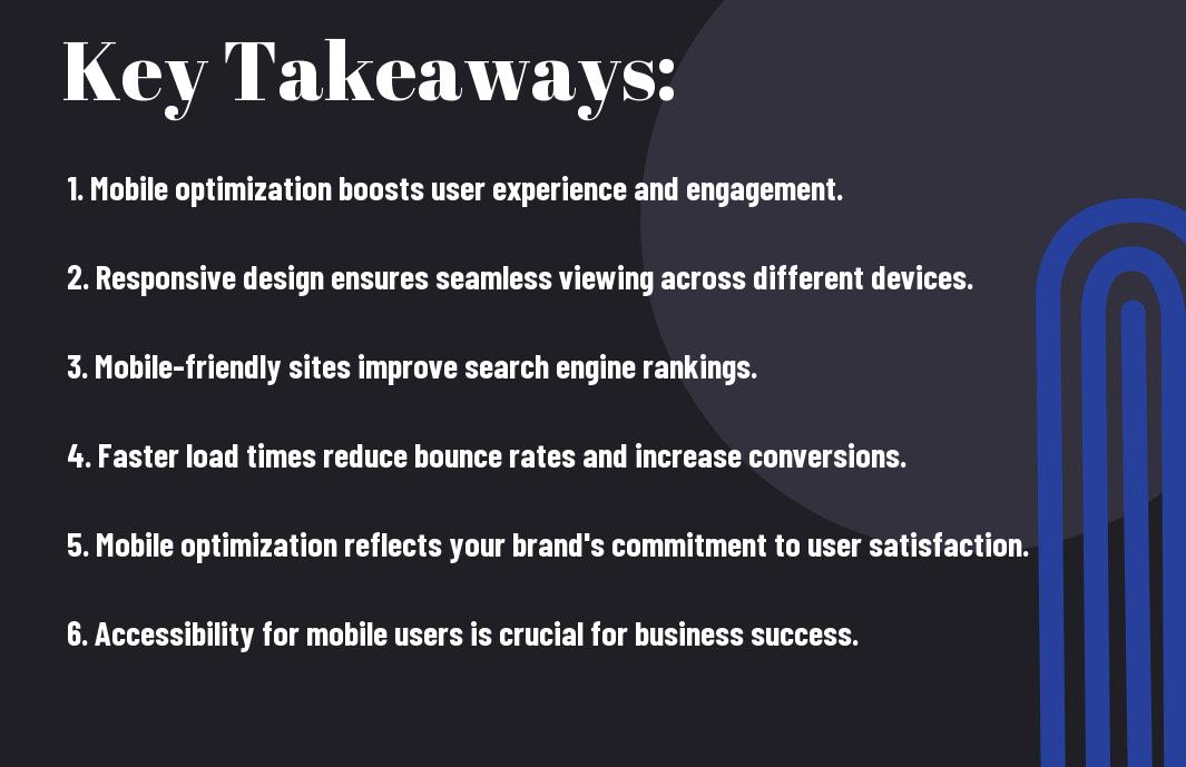
Key Takeaways:
- Mobile optimization is crucial for website design, as the majority of internet users access websites through their mobile devices.
- Having a mobile-friendly website design can improve user experience and increase conversion rates.
- Mobile optimization also improves search engine rankings, as search engines prioritize mobile-friendly websites in their mobile search results.
- Ignoring mobile optimization can result in frustrated users, high bounce rates, and ultimately loss of potential customers.
- Utilizing responsive design and optimizing website content for mobile users can drastically improve overall user engagement and business success.
The Essentials of Mobile-Friendly Design
While optimizing your website for mobile users, there are a few key elements you need to consider. Mobile-friendly design is essential for providing a positive user experience, improving search engine rankings, and increasing conversion rates. In this chapter, we’ll explore the essentials of mobile-friendly design and why they matter for your website.
Responsive Design Principles
When it comes to mobile-friendly design, responsive design principles are crucial. Responsive design ensures that your website adapts to different screen sizes and devices, providing a consistent and optimized experience for all users. By using fluid grids, flexible images, and media queries, you can create a website that automatically adjusts to the user’s device, whether they’re accessing it from a smartphone, tablet, or desktop. This not only improves user experience but also plays a significant role in improving your website’s search engine rankings.
Utilizing Mobile-First Approach
Another essential aspect of mobile-friendly design is utilizing a mobile-first approach. This means designing and developing your website with a primary focus on mobile users before addressing desktop users. By prioritizing mobile users, you ensure that your website delivers an optimal experience on smaller screens, touch interfaces, and slower connection speeds. This approach is crucial because the majority of internet traffic now comes from mobile devices, and if your website isn’t optimized for mobile, you could be missing out on a significant portion of your potential audience. When you prioritize mobile users, you’re also setting yourself up for future success, as the trend towards mobile usage continues to grow.
Technical Aspects of Mobile Optimization
Despite the growing importance of mobile optimization, many websites still struggle to provide a seamless experience for their mobile users. When it comes to technical aspects, there are several key considerations that you need to keep in mind to ensure that your website is optimized for mobile users.
Speed and Performance Considerations
When it comes to mobile optimization, speed and performance are critical factors. Your website’s loading speed can significantly impact user experience. Research has shown that 53% of mobile visitors will leave a website if it takes longer than three seconds to load. Slow loading times can lead to frustration and a higher bounce rate, ultimately affecting your site’s search engine rankings. To optimize for mobile, you need to minimize server response time, optimize images, and leverage browser caching to ensure your website performs well on mobile devices.
Navigational Structure for Mobile Users
Another important aspect of mobile optimization is the navigational structure of your website. When users access your site on a mobile device, easy navigation is crucial to help them find the information they need quickly and efficiently. You need to ensure that your menu and navigation options are user-friendly on mobile devices, with clear, easy-to-click buttons and streamlined navigation paths. Additionally, it’s important to prioritize the content that is most valuable to mobile users and make it easily accessible on smaller screens.
The Impact on Search Engine Rankings
To ensure that your website ranks well in search engine results, it’s crucial to have a mobile-friendly design. Mobile optimization is a significant ranking factor for search engines like Google. In fact, Google has transitioned to a mobile-first indexing approach, where the mobile version of your site becomes the starting point for what Google includes in its index.
You can read more about the importance of website mobile optimization in The importance of website mobile optimization in website traffic.
Mobile-First Indexing by Search Engines
With mobile-first indexing, Google predominantly uses the mobile version of the content for indexing and ranking. This means that if your website is not optimized for mobile devices, it may not rank well in search results. Having a mobile-friendly design is critical for maintaining or improving your search engine rankings.
The Role of User Experience (UX) in SEO
When it comes to search engine optimization (SEO), user experience (UX) plays a crucial role. A mobile-friendly website design enhances the overall user experience which, in turn, positively impacts your SEO efforts. By optimizing your website for mobile users, you can provide a better user experience and increase your chances of ranking higher in search engine results.

Strategies for Effective Mobile Optimization
Not optimizing your website for mobile users can significantly impact your business’s success. With more and more people using their smartphones and tablets to access the internet, it’s crucial that your website is optimized for mobile devices. By focusing on mobile optimization, you can improve user experience, increase engagement, and ultimately drive more conversions. To learn more about how to optimize your website for mobile, check out this guide on How to Optimize Your Website for Mobile.
Tools and Resources for Testing Mobile Responsiveness
When it comes to testing mobile responsiveness, there are several tools and resources available to help you ensure that your website is delivering a seamless experience for mobile users. Tools like Google’s Mobile-Friendly Test and BrowserStack allow you to test your website’s responsiveness across different devices and screen sizes. Additionally, resources such as Google’s Mobile SEO Guide and the W3C Mobile Checker provide valuable insights and best practices for mobile optimization.
Best Practices for a Mobile-Friendly Website
Creating a mobile-friendly website involves following best practices that enhance the user experience and ensure that your site is easily accessible and navigable on mobile devices. This includes implementing a responsive design that adapts to various screen sizes, optimizing page load times, and utilizing mobile-friendly navigation. By prioritizing fast load times, intuitive navigation, and easy access to information, you can create a mobile-friendly website that delivers a positive experience for your users.
Is Your Website Design Optimized for Mobile Users and Why It Matters
Conclusively, as you consider the importance of mobile optimization for your website design, it is crucial to recognize that the majority of internet users now access the web through mobile devices. If your website is not user-friendly on mobile, you are likely missing out on a significant portion of potential visitors and customers. By prioritizing mobile optimization, you can provide a seamless and enjoyable browsing experience for all users, ultimately leading to higher engagement, increased conversions, and greater overall success for your online presence. Ensuring that your website design is optimized for mobile users is not just a trend, but a must for any business or individual looking to make an impact in the digital space.
FAQ
Q: Why is it important for my website design to be optimized for mobile users?
A: It is important for your website design to be optimized for mobile users because a large portion of internet traffic comes from mobile devices. Additionally, mobile optimization can improve user experience, increase conversion rates, and positively impact your site’s search engine rankings.
Q: How can I tell if my website design is optimized for mobile users?
A: You can test your website’s mobile optimization by using Google’s Mobile-Friendly Test or by simply viewing your site on various mobile devices. Look for easy navigation, quick loading times, and responsive design elements.
Q: What are the key elements of a mobile-optimized website design?
A: Key elements of a mobile-optimized website design include responsive design, fast loading times, easy navigation, legible text, and optimized images and videos. These elements ensure a seamless and enjoyable experience for mobile users.
Q: How can mobile optimization impact my website’s search engine rankings?
A: Google uses mobile-first indexing, which means it primarily uses the mobile version of a website for ranking and indexing. If your website is not optimized for mobile users, it may be penalized in search engine results, leading to lower visibility and traffic.
Q: What steps can I take to optimize my website for mobile users?
A: To optimize your website for mobile users, consider implementing responsive design, optimizing images and videos, prioritizing mobile-friendly content, and improving page speed. You can also consult with a web developer or digital marketing agency for professional assistance.