
Ensuring that your website is mobile-friendly is crucial in today’s digital age. With more and more consumers relying on their smartphones and tablets to access information and make purchases, it is imperative that your website is optimized for mobile devices. If your website is not mobile-friendly, you risk losing potential customers and damaging your brand’s reputation. In this blog post, we will discuss the importance of mobile-friendly website design and the key reasons why you should prioritize this aspect of your online presence.
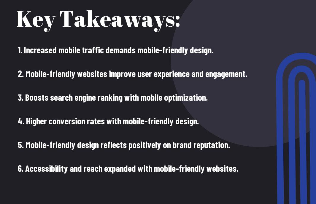
Key Takeaways:
- Enhanced User Experience: A mobile-friendly website design ensures a better user experience for visitors accessing your site on their mobile devices.
- Improved SEO: Mobile-friendly websites are favored by search engines, which can lead to improved search rankings and increased organic traffic.
- Increased Conversions: A mobile-friendly design can lead to higher conversion rates as it allows for easier navigation and a seamless user experience.
- Wider Audience Reach: With the increasing use of mobile devices, having a mobile-friendly website design can help you reach a wider audience and attract more potential customers.
- Competitive Advantage: In today’s digital landscape, having a mobile-friendly website is essential to stay competitive and meet the needs of your tech-savvy audience.

The Impact of Mobile-Friendly Design
While the importance of having a mobile-friendly website cannot be overstated, you may still be wondering about its actual impact. Let’s delve into three key factors that underscore the significance of mobile-friendly design for your website.
User Experience (UX)
When you visit a website on your mobile device and find that it’s not optimized for mobile viewing, how does it make you feel? Frustrated? Annoyed? Research shows that 57% of internet users say they won’t recommend a business with a poorly designed website on mobile. Responsive design, which ensures a seamless experience across all devices, is essential for keeping visitors engaged and committed to your brand.
Search Engine Optimization (SEO)
As you work on improving your website’s visibility on search engines, you cannot afford to overlook the significance of mobile-friendliness. In 2015, Google announced that it would be using mobile-friendliness as a ranking signal for searches conducted on mobile devices. In other words, if your website is not mobile-friendly, your SEO efforts could be seriously compromised. This can lead to a drop in your search rankings, making it harder for potential customers to find you.
Conversion Rates and Business Growth
Do you want to increase your conversion rates and drive business growth? A mobile-friendly website is non-negotiable. Studies reveal that 61% of users are unlikely to return to a mobile site they had trouble accessing and 40% will visit a competitor’s site instead. By providing a positive mobile user experience, you can boost your conversion rates and ultimately, your business revenue.
Key Elements of Mobile-Friendly Websites
To ensure that your website is optimized for mobile use, there are several key elements that you need to consider. Mobile website design is crucial in today’s digital landscape, as more and more people are accessing the web from their mobile devices. In fact, mobile web traffic has surpassed desktop traffic, making it essential to have a mobile-friendly website. If you want to learn more about why having a mobile-friendly website is important, check out our blog post on 3 Reasons Why A Mobile-Friendly Website Is Important.
Responsive Design Principles
One of the most important elements of a mobile-friendly website is responsive design. This means that your website is able to adapt to different screen sizes and resolutions, ensuring that it looks and functions seamlessly on any device. This includes using flexible images and fluid grids to create a responsive layout that adjusts to the screen size, providing a better user experience.
Readability and Navigation
When it comes to mobile-friendly design, readability and navigation play a crucial role in ensuring that users can easily access and consume your content. This includes using legible font sizes, clear navigation menus, and concise content that is easy to read on smaller screens. Easy navigation and clear, readable content are key to keeping users engaged on your mobile site.
Speed Optimization
Mobile users expect fast loading times, so speed optimization is essential for a mobile-friendly website. This includes minimizing HTTP requests, optimizing images, and leveraging browser caching to improve load times. Slow-loading websites can lead to high bounce rates and poor user experience, so ensuring your site is optimized for speed is crucial.
Challenges in Implementing Mobile-Friendly Design
Unlike traditional desktop website design, implementing a mobile-friendly design comes with its own set of challenges. It requires a shift in mindset and a keen understanding of the technical and visual aspects that come into play when creating a website that is responsive on all devices. Here are a few challenges that you may encounter when implementing a mobile-friendly design for your website.
Technical Considerations
When it comes to technical considerations, ensuring that your website is responsive and performs well across various mobile devices can be a daunting task. You have to take into account factors such as loading times, image optimization, and compatibility with different browsers and operating systems. Your website’s code must be clean and efficient, and you may need to implement techniques such as responsive web design and mobile-first development to ensure a seamless user experience.
Balancing Aesthetics with Functionality
One of the challenges in implementing a mobile-friendly design is finding the right balance between aesthetics and functionality. While you want your website to look visually appealing on mobile devices, you also need to ensure that it is intuitive and easy to navigate. This means making tough decisions about which design elements to prioritize and how to streamline the user interface without sacrificing the overall look and feel of your website. It’s crucial to prioritize user experience and ensure that your mobile-friendly design enhances the overall functionality of your website.
Building a Mobile-Friendly Website
Your website is the digital storefront for your business, and it’s crucial to ensure that it is optimized for mobile users. With the increasing reliance on mobile devices for internet browsing, having a mobile-friendly website can make or break your online presence. In fact, according to The Importance Of Mobile-Friendly Website, 57% of internet users say they won’t recommend a business with a poorly designed mobile site. Given these statistics, it’s clear that building a mobile-friendly website is essential for success in today’s digital landscape.
Planning and Strategy
When planning and developing a mobile-friendly website, it’s essential to prioritize the user experience. Your website design should be responsive, ensuring that it adapts seamlessly to various screen sizes and devices. This means that your content, images, and layout should adjust to provide the best possible experience for mobile users. Research your target audience to understand their typical browsing behaviors and preferences. Identify the most important elements of your website and ensure they are front and center on the mobile version. Plan for easy navigation and prioritize fast-loading pages to keep mobile users engaged.
Testing and Improvement
Once your mobile-friendly website is up and running, it’s crucial to regularly test and improve its performance. Test your website on various devices and screen sizes to ensure that it functions as intended. Monitor loading times and optimize your website’s speed to keep mobile users from bouncing. Solicit feedback from users and make improvements based on their experience. Keep in mind that mobile browsing habits and technology are constantly evolving, so continuously make adjustments to stay ahead of the curve.
Conclusion
So, when it comes to the importance of mobile-friendly website design, it cannot be overstated. In today’s digital age, a significant percentage of website traffic comes from mobile devices. If your website is not optimized for mobile use, you risk turning away potential customers and damaging your online presence. By ensuring that your website is easily accessible and navigable on mobile devices, you can improve user experience, increase engagement, and ultimately drive more conversions. Your business’ success in the digital realm relies heavily on the user experience, and having a mobile-friendly website design is essential to meeting the expectations of today’s consumers. Therefore, it is crucial to prioritize mobile optimization to stay competitive in the online marketplace.
FAQ
Q: Why is mobile-friendly website design important?
A: Mobile-friendly website design is important because of the growing number of users accessing the internet on mobile devices. A mobile-friendly website ensures a positive user experience and can improve search engine rankings.
Q: How does mobile-friendly website design impact user experience?
A: Mobile-friendly website design impacts user experience by ensuring that the website is easy to navigate, images and text are displayed properly, and load times are optimized for mobile devices. This leads to higher user engagement and satisfaction.
Q: What are the benefits of having a mobile-friendly website?
A: The benefits of having a mobile-friendly website include reaching a larger audience, improved search engine rankings, higher conversion rates, and better overall user experience. Additionally, it can help in building brand reputation and credibility.
Q: How can I make my website more mobile-friendly?
A: To make your website more mobile-friendly, you can use responsive web design, optimize images and videos for mobile, improve page load times, simplify navigation, and use mobile-friendly touch controls. Regular testing on various mobile devices is also crucial.
Q: What are the consequences of not having a mobile-friendly website?
A: Not having a mobile-friendly website can result in higher bounce rates, lower search engine rankings, loss of potential customers, and damage to your brand’s reputation. With the majority of internet users accessing websites on mobile devices, failing to adapt can severely impact your online presence and business success.